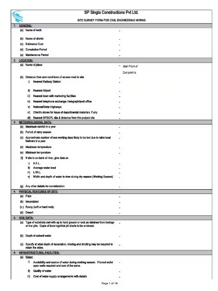
Understanding Your Data: A Guide to Survey Report Sample Creation
Understanding Your Data: A Guide to Survey Report Sample Creation
Many businesses and researchers struggle with effectively communicating survey results. A well-crafted survey report is crucial for making sense of collected data and using it to drive informed decisions. This article will guide you through the process of creating compelling and insightful survey reports, providing practical examples and tips to help you get started. We'll even look at a survey report sample to illustrate key concepts.
The Importance of Visual Communication in Survey Reports
A survey report, regardless of its subject – be it customer satisfaction, employee engagement, or market research – is only as good as its ability to communicate findings clearly and concisely. Numbers alone often fail to capture attention or convey the full story.
This is where visual elements become invaluable. Charts and graphs transform raw data into easily digestible information, highlighting trends and patterns that might otherwise go unnoticed. Using visuals makes even complex data sets accessible to a wider audience, fostering better understanding and collaboration.
Key Components of an Effective Survey Report
A well-structured survey report goes beyond simply presenting data; it tells a story. Here are some essential components:
Introduction: Briefly explain the survey's purpose, methodology, and target audience. This sets the context for the findings.
Executive Summary: Present the most important findings upfront, highlighting key trends and conclusions. Think of this as the "tl;dr" version of your report.
Methodology: Detail how the survey was conducted, including the sample size, sampling method, and response rate. Transparency builds trust and credibility.
Data Presentation: Use charts, graphs, and tables to visually represent your data. Choose the most appropriate visualization type for each data set (see examples below).
Analysis and Interpretation: Analyze the data objectively, avoiding subjective interpretations. Explain the implications of your findings and highlight any notable trends or patterns.
Conclusion: Summarize your key findings and suggest recommendations based on the data. This section should provide actionable insights.
The choice of visualization significantly impacts the report's clarity and effectiveness. Here are a few examples:
Bar Charts: Ideal for comparing categories (e.g., customer satisfaction ratings across different product lines, employee engagement scores by department).
Pie Charts: Excellent for showing proportions (e.g., the percentage of respondents who prefer a specific feature, the distribution of responses across different age groups).
Donut Charts: Similar to pie charts but can accommodate multiple data series, allowing for more nuanced comparisons (e.g., candidate preferences across different regions).
Smile Indicators: These provide a quick, intuitive visual representation of sentiment, often using a simple scale ranging from very unhappy to very happy.
Tables: Useful for presenting detailed numerical data, particularly when precise figures are important.
Real-World Survey Report Sample Scenarios
Let's consider a few examples to understand how different visualizations effectively represent various data types:
Meeting Effectiveness Survey: A bar chart could compare participant satisfaction with different meeting formats (e.g., in-person vs. virtual).
Lemonade Stand Customer Satisfaction Survey: A simple pie chart could show the distribution of customer ratings (e.g., excellent, good, fair, poor).
Straw Poll on Candidate Preferences: A donut chart could visualize candidate popularity across different demographic segments (e.g., age, gender, location). A survey report sample illustrating such analysis could be incredibly useful for political campaign strategists.
Incorporating Storytelling and Audience Consideration
Beyond the visual elements, a strong narrative is crucial. Present your data in a compelling way, using storytelling elements to connect with the reader and make the findings more memorable.
Remember your audience. Tailor the report's language, level of detail, and visualization choices to their knowledge and needs. A report for senior executives will differ greatly from one intended for a team of junior analysts. Consider their time constraints and focus on delivering the most relevant information.
Utilizing Survey Report Builder Tools
Creating professional-looking survey reports doesn't require advanced design skills. Numerous tools simplify the process. For example, Jotform's Report Builder allows you to easily generate visually appealing reports from your survey data, saving you valuable time and effort. Many other similar platforms are available, catering to different needs and budgets.
Crafting an effective survey report involves more than just presenting numbers. By combining clear visual communication, a compelling narrative, and audience awareness, you can transform raw survey data into actionable insights that drive better decision-making. Remember to consider the key components outlined above and leverage available tools to streamline the process. With practice and attention to detail, you can confidently create impactful survey reports that effectively communicate your findings and propel your business or research forward. Start by exploring different survey report sample templates online to get inspired and understand best practices. Remember that a well-structured survey report sample can serve as an excellent starting point.
Frequently Asked Questions: Survey Report Samples
Here are some frequently asked questions about creating effective survey report samples:
What are the key elements of a well-structured survey report?
A well-structured survey report should include essential metadata such as the completion rate, the total number of responses received, and the number of times the survey was viewed. It needs to clearly present both individual responses (where appropriate) and a detailed analysis of the results from closed-ended questions. Including a concise summary of the key findings upfront is crucial.
What types of visuals are best for presenting survey data?
Different visuals suit different types of data. Bar charts are excellent for comparing categories (e.g., responses across different roles or industries). Pie charts effectively illustrate proportions (e.g., distribution of meeting durations or formats). Donut charts are useful for displaying multiple data series (e.g., candidate preferences across various regions). Smile indicators provide a user-friendly representation of sentiment. Tables are also valuable for presenting detailed numerical data. The choice of visual should always be guided by the type of data and the message you want to convey.
How can I make my survey report more engaging and easy to understand?
Employ storytelling techniques to provide context and explain the survey's purpose. Present the most significant findings first to immediately grab the reader's attention. Use clear and concise language, avoiding jargon. Remember to tailor the report's content and presentation style to your audience's understanding of the topic, their available time, and their role in the decision-making process. Most importantly, leverage visuals to enhance comprehension and make the data more accessible.
What is the importance of objective data presentation in a survey report?
Objectivity is paramount. Avoid subjective interpretations of the data. Present the findings in a neutral manner, letting the data speak for itself. Clearly distinguish between facts and inferences. This ensures the report's credibility and prevents misinterpretations.
Are there any tools that can help me create professional survey reports?
Yes, several tools are available to facilitate the creation of professional and visually appealing survey reports. Examples include Jotform Report Builder and other similar report generation software. These tools often offer pre-designed templates and various visualization options, streamlining the report creation process.
How do I choose the right visual for my specific data?
Consider the type of data you're presenting. For comparisons among categories, use bar charts. For proportions, pie charts are effective. Donut charts are beneficial when comparing multiple data series within categories. If you are dealing with sentiment data, a smile indicator can provide an intuitive visual representation. Always select the visual that most clearly and effectively communicates the data's meaning to your audience.
What is the purpose of including a completion rate and response numbers in the report?
Including the completion rate and the number of responses provides crucial context and transparency. It allows the reader to understand the scope and limitations of the survey data. A low completion rate might indicate potential biases, while a high response rate generally suggests greater reliability, though other factors need to be considered for overall data validity.
How can I tailor my survey report to different audiences?
Consider the audience's level of understanding of the subject matter, their time constraints, and their role in the decision-making process. Adjust the level of detail, the language used, and the length of the report accordingly. For a non-technical audience, use simpler language and focus on key takeaways. For a highly technical audience, you might include more detailed statistical analysis.